This self written project was brand design and with this I chose Dr. Martens, it has been around for over 70 years and as of yet hasn't rebranded once, its been at the heart of British fashion for years and a avid supporter of standing out and thriving in being different.
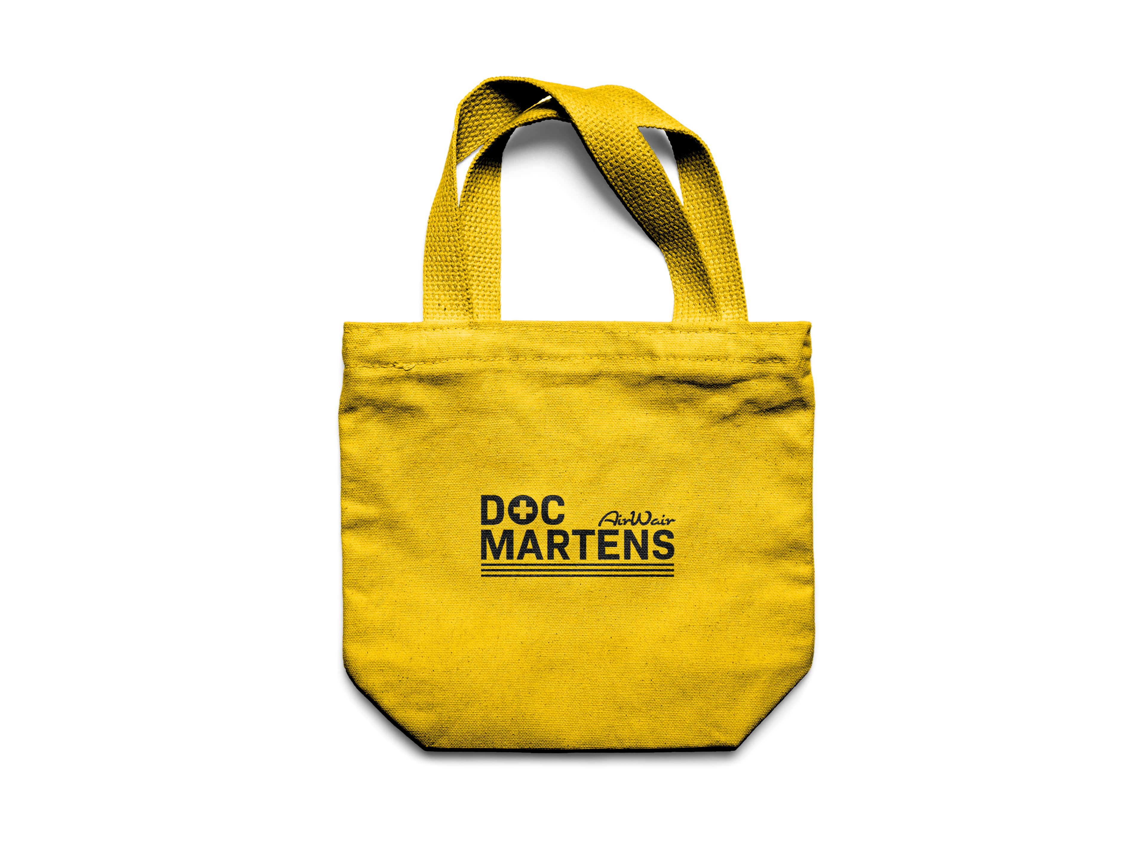
The new logo uses a sans serif typeface called Bio Sans Bold for the main typeface and CuisineOT Pro for the "AirWair" portion of the logo. The new typeface means that the company has a more modern and high fashion look to it, that of which whilst its working class routes is where the brand is currently at.
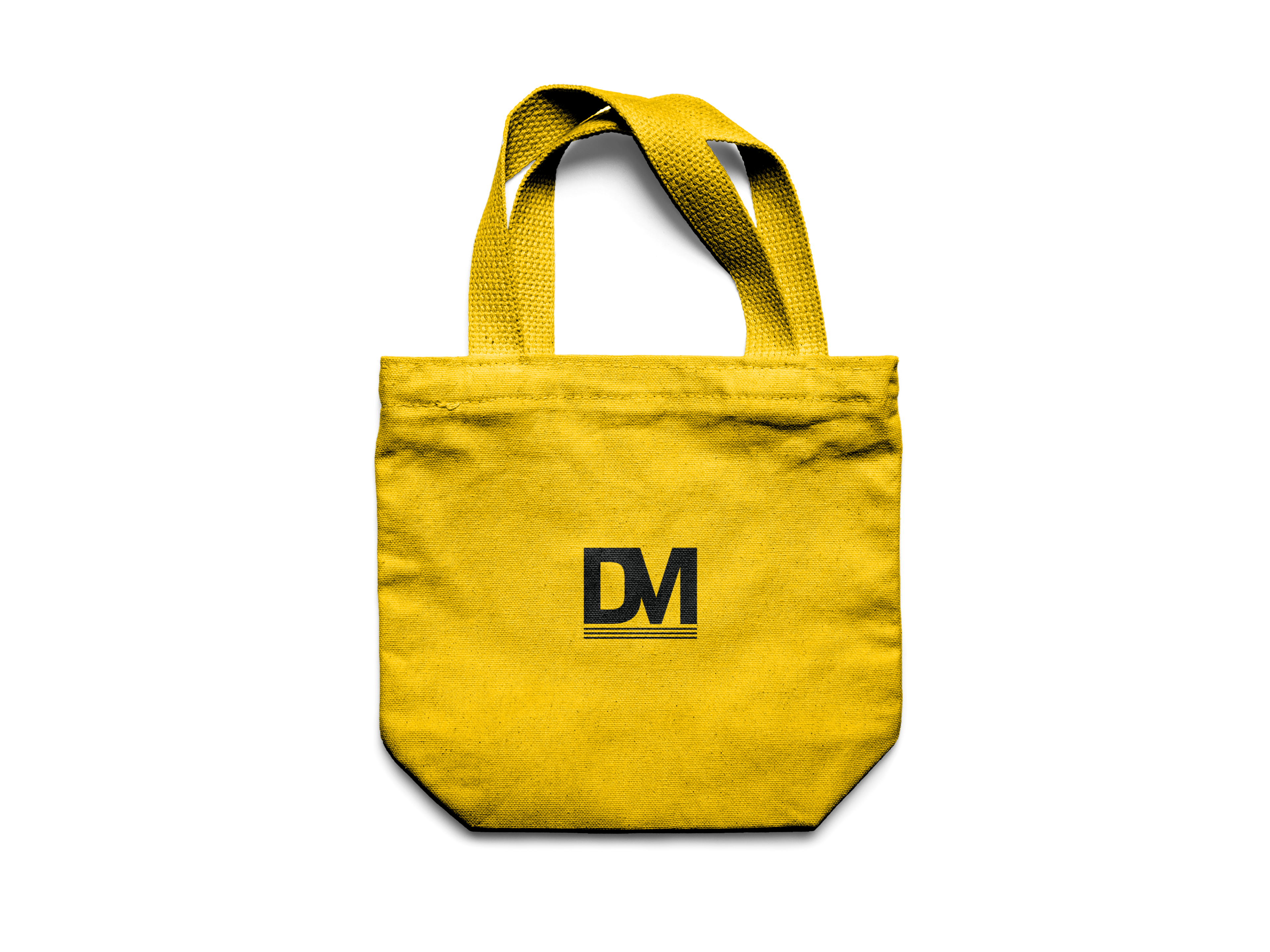
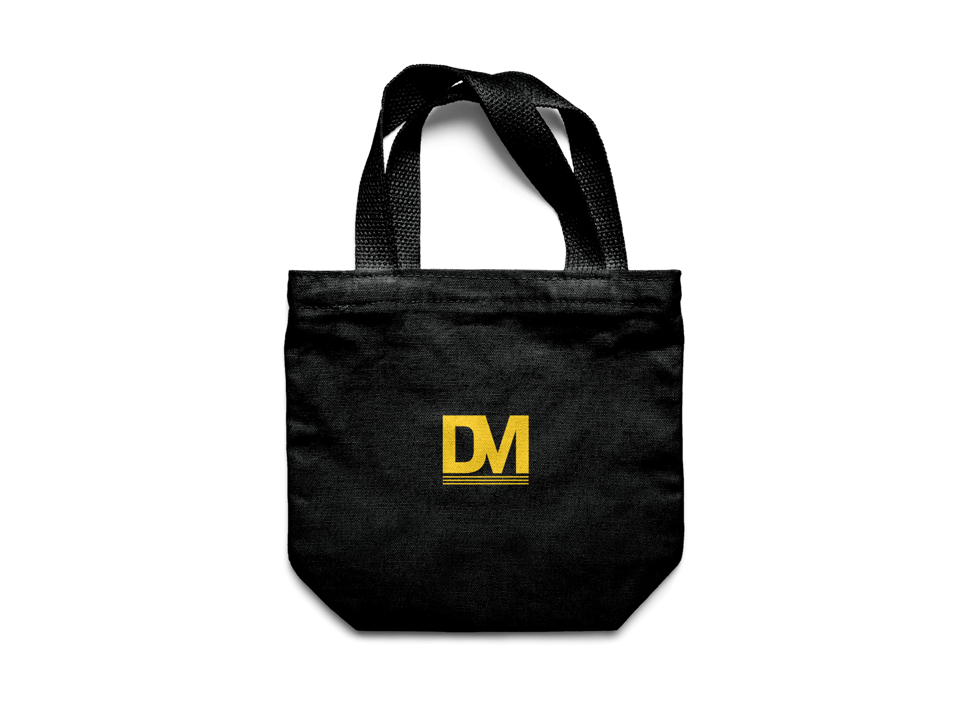
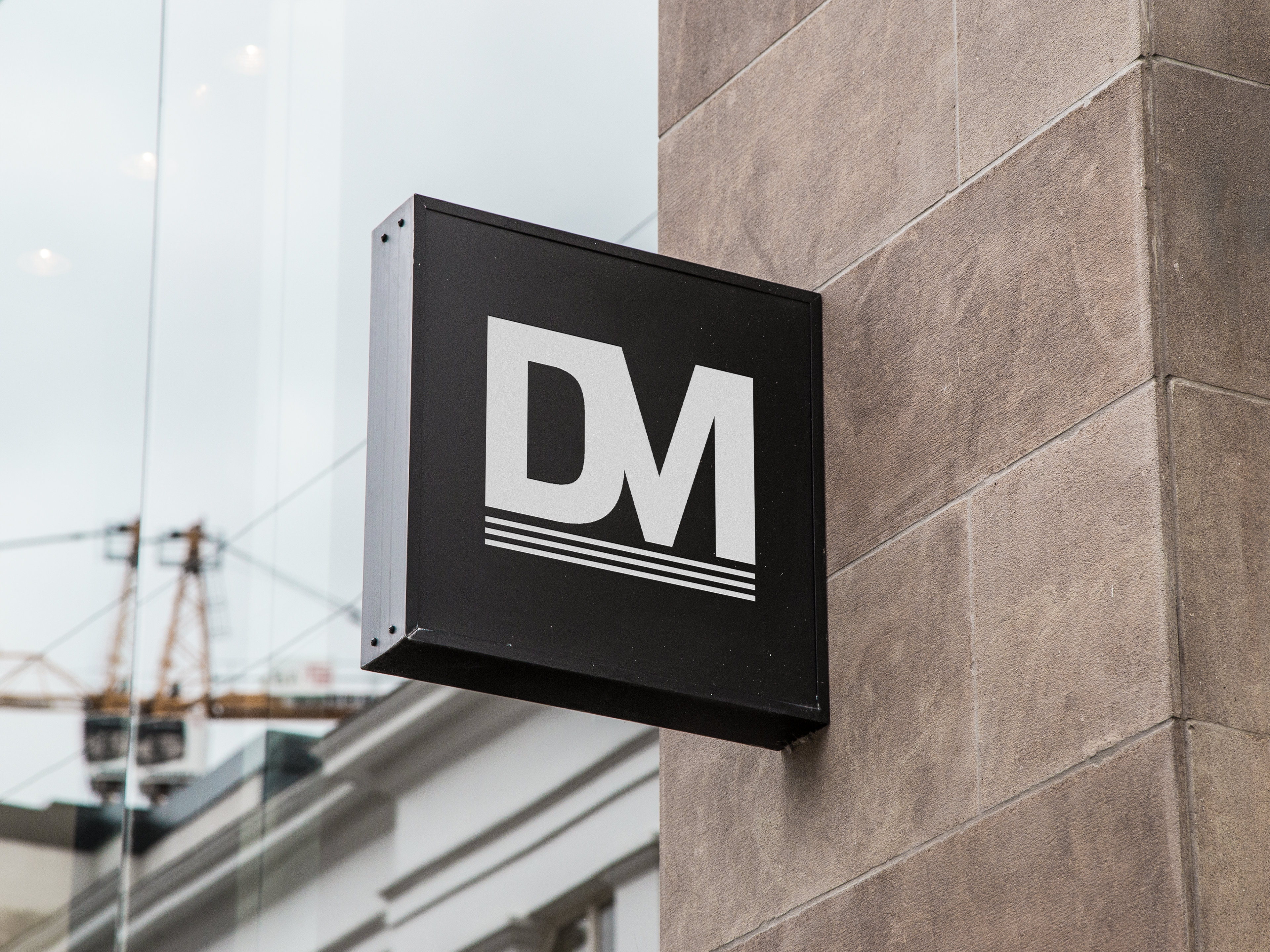
The cross symbol replaces the "O" of the DOC part of the logo of which was also changed to fit more in line with the slang most commonly used when talking about the brand, the same was also considered with the logomark DM that both creates a brand symbol on top of the cross but also again meets this shortened version of the brand name.
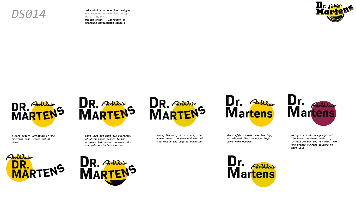
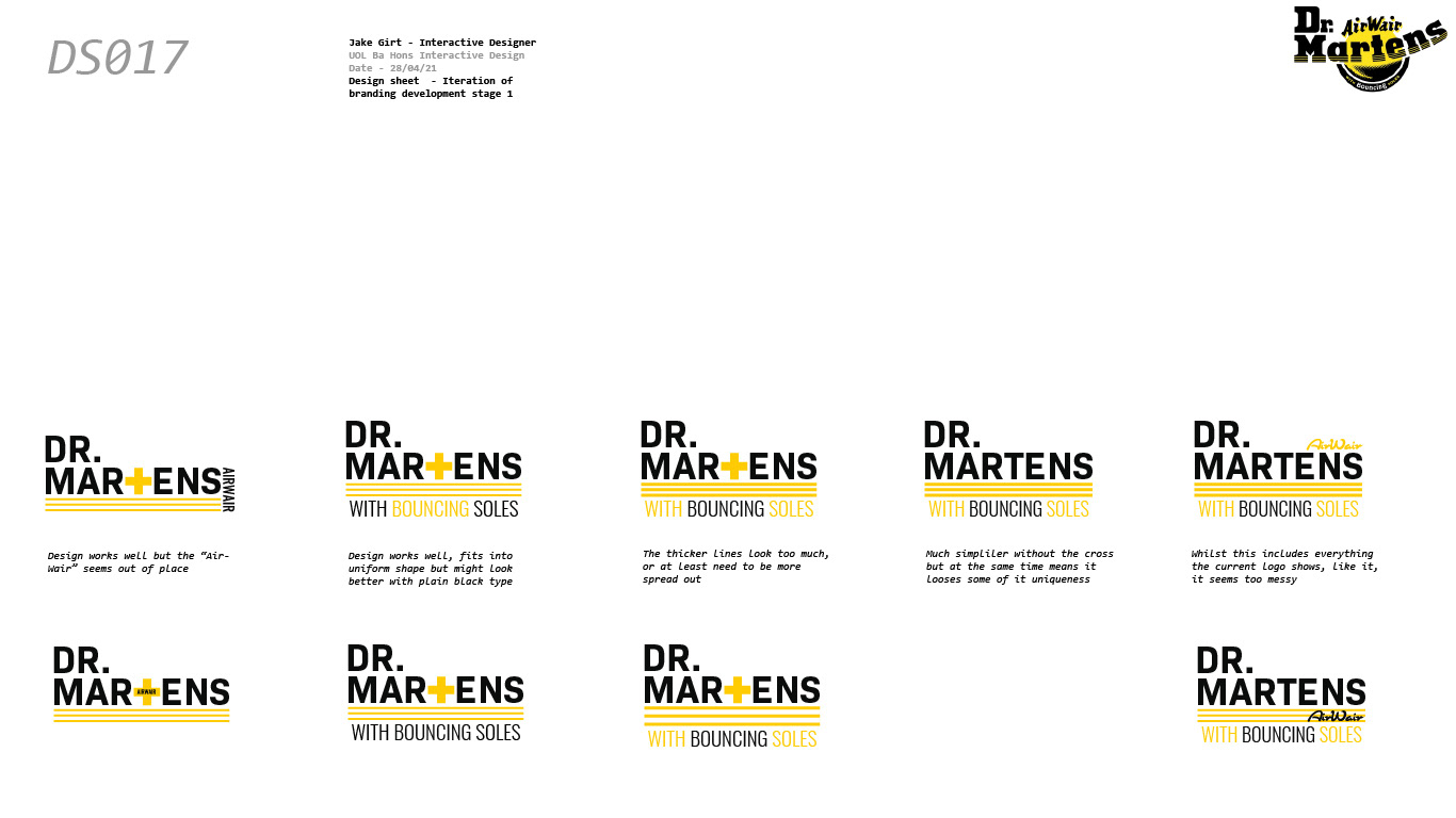
I created a new yellow for the brand as the old one was too acidic, the newer version is more web friendly. To create the logo however I developed several design sheets to each with varying themes in logo and gave brief comments about each, what I liked and what I didn't.
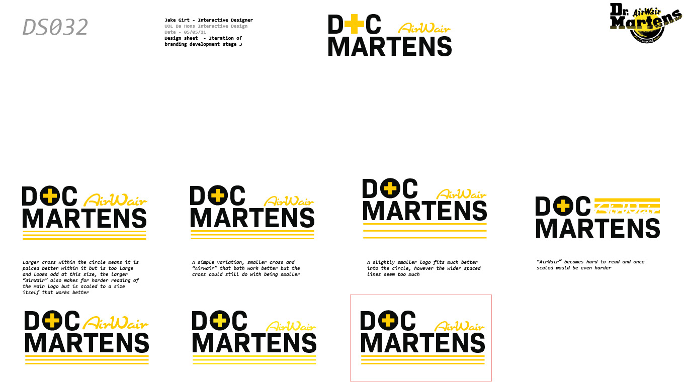
With this new logo I created mock-ups and branding around this using the themes of the current brand. All photography is owned by Dr. Martens and was sourced from their social media and website, I do not own nor take credit for these photographs but simply used them as a basis for the designed advertisements.
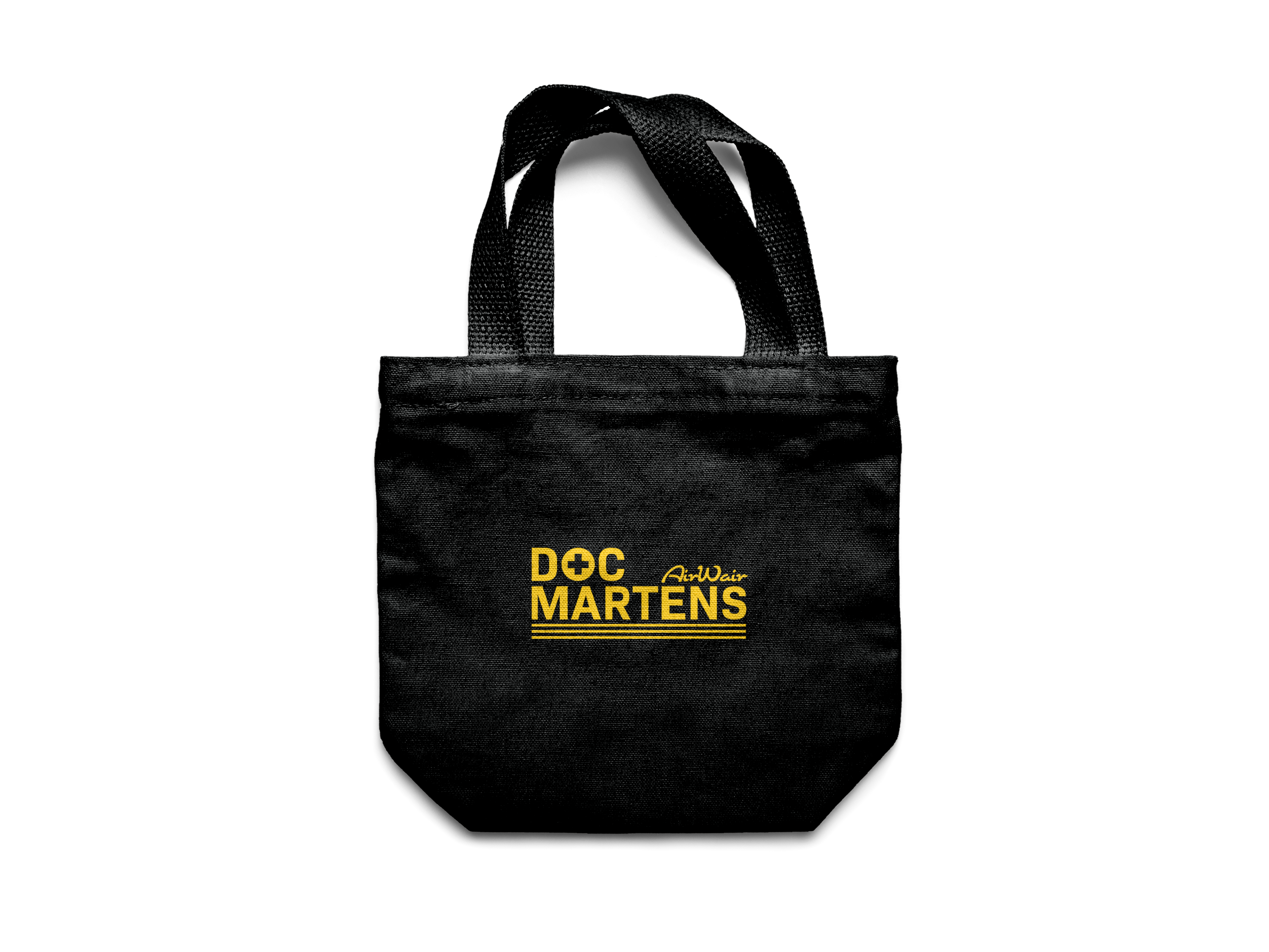
Canvas Bags
Shoe Box
Posters

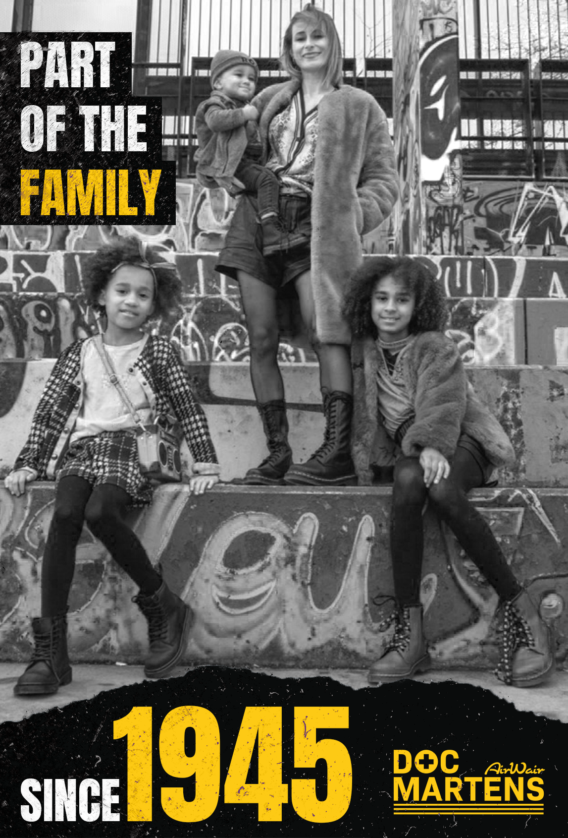
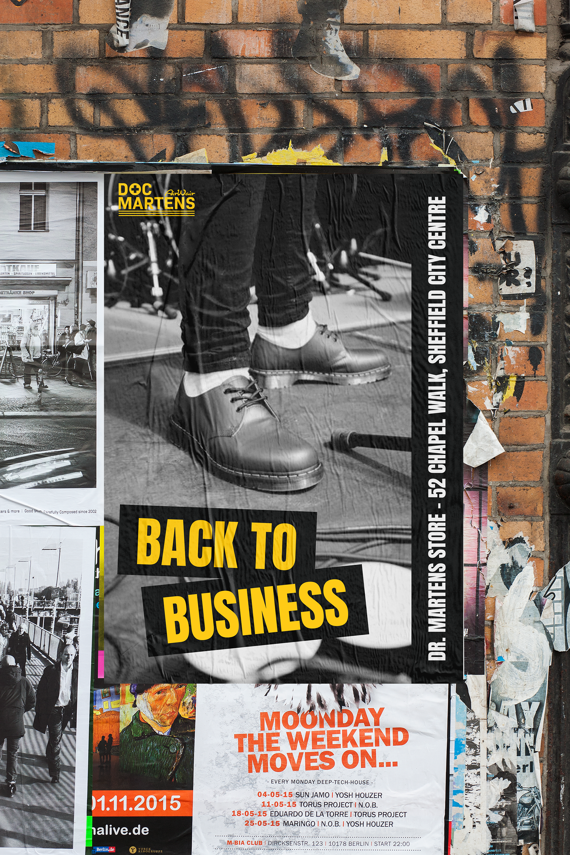
Mock ups
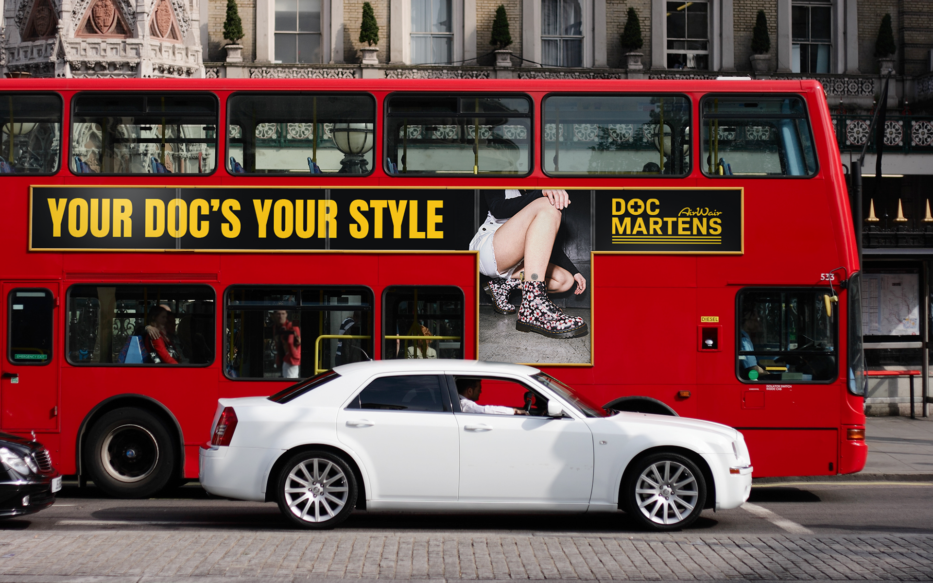
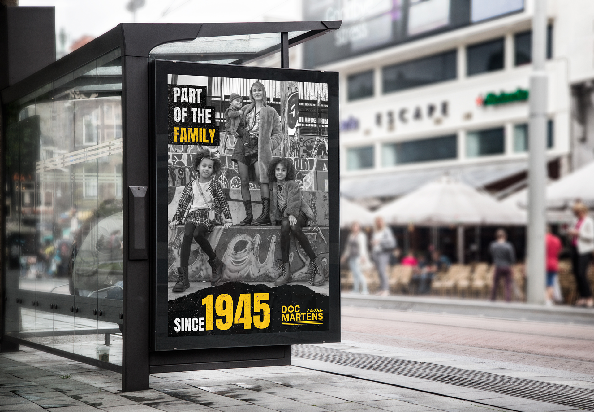
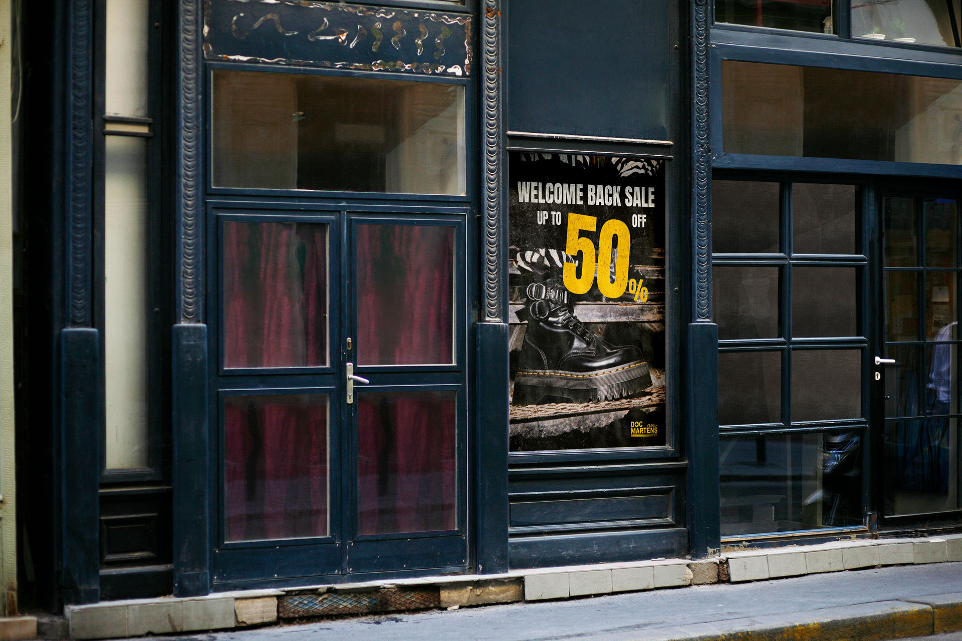

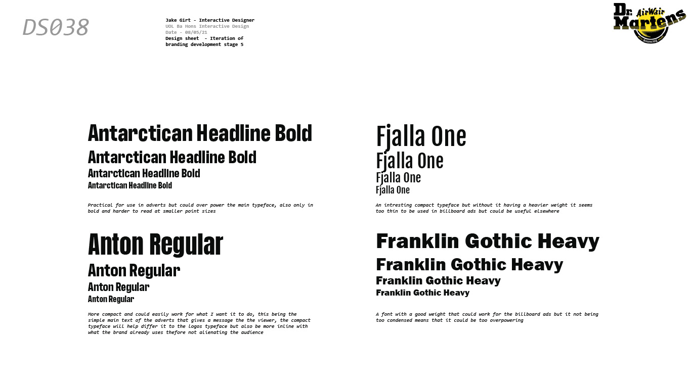
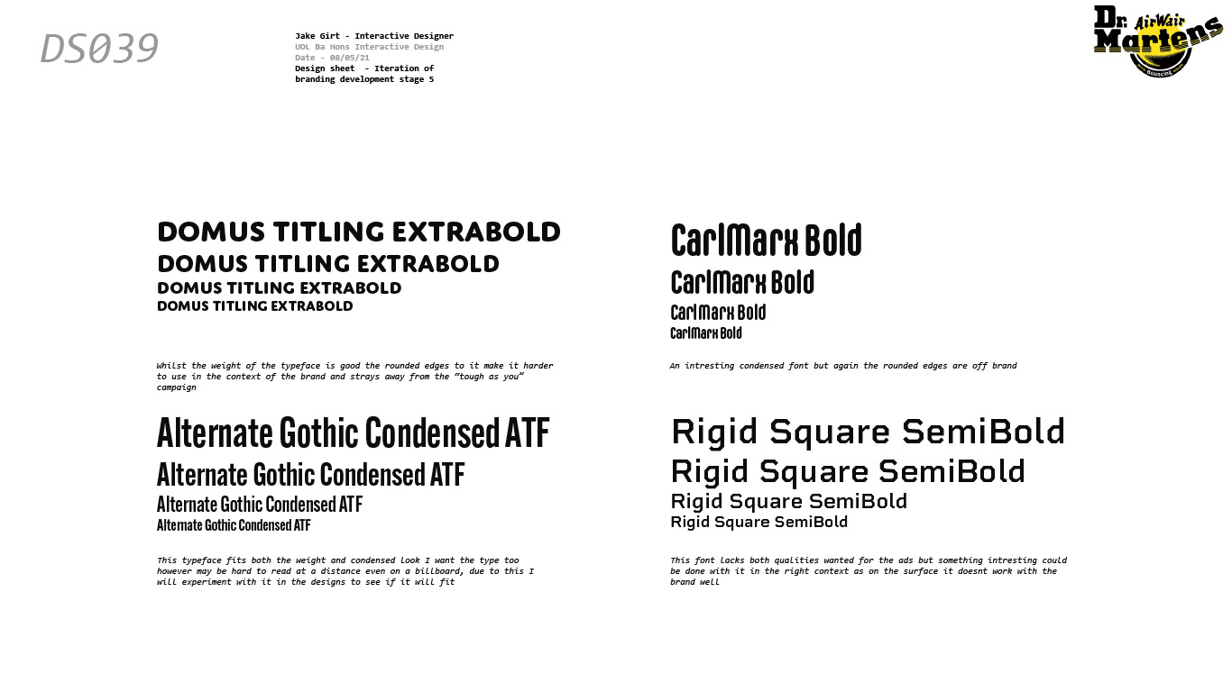
To choose the correct typeface for these advertisements I looked at what the brand currently used and found typefaces similar to this to work with, and from this chose one. I decided to go with a similar typeface for the branding as I didn't want to alienate existing customer and also not stray too far from the brands themes.
